5 minutes read
From Legacy to Lifeline: Modernizing America's 911 Infrastructure
A browser-based CAD system that replaced decades-old dispatch software for the 911 saving 2–3 minutes per emergency response.
5 minutes read
A browser-based CAD system that replaced decades-old dispatch software for the 911 saving 2–3 minutes per emergency response.
01 — Overview
The main challenge while designing Computer-Aided Dispatch (CAD) system was to make a simple and clear system that could handle lots of real-time information, especially for emergency situations. This task tested my skills in creating a user-friendly system that meets the needs of dispatchers and first responders effectively.
Impact
Reduced time spent on user flows for officers and the agencies, resulted in Hamilton County catching a terrorist in 3 minutes using CAD dashboard.
02 — Background
Computer Aided Dispatch is the software backbone of emergency response in America. When someone calls 911, the CAD system orchestrates the entire chain — from capturing the caller's information to dispatching police, fire, or EMS units to the scene.
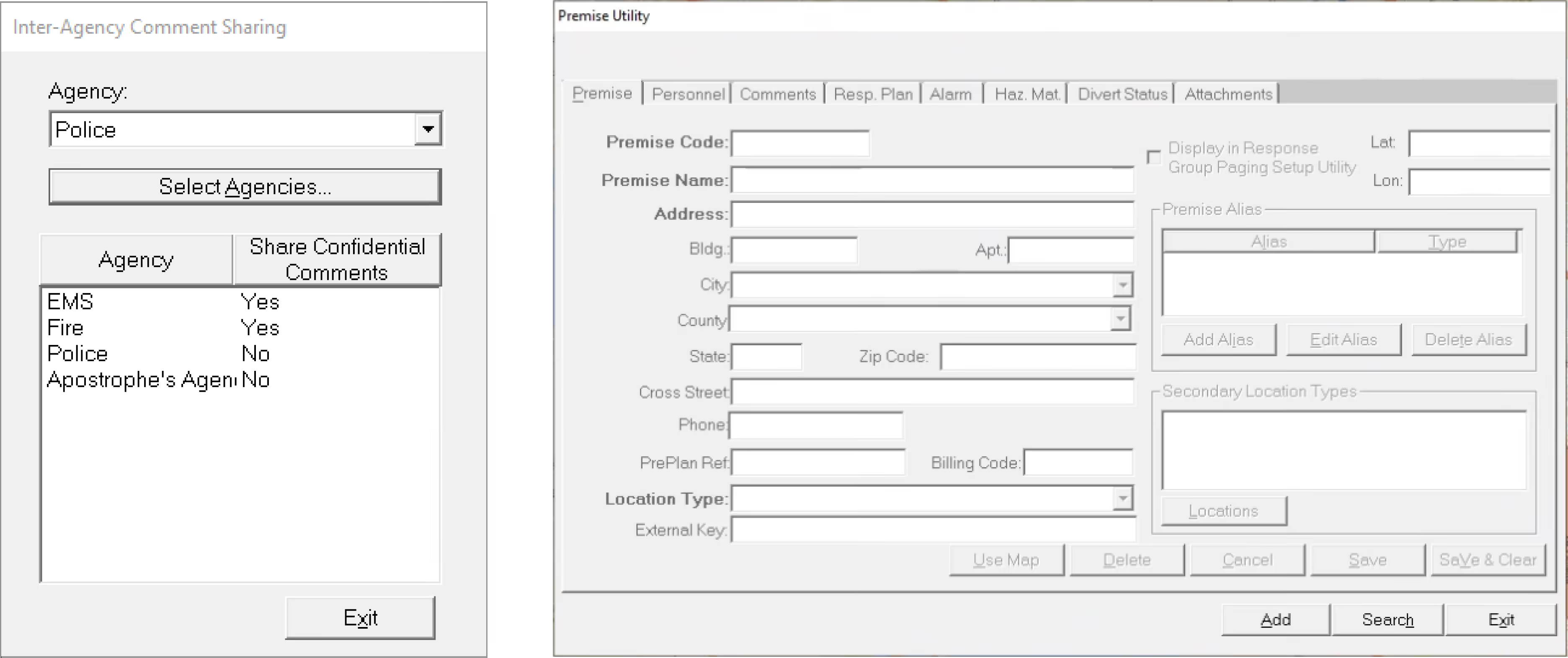
The existing system was built decades ago. Dispatchers worked across multiple monitors running dense, unintuitive interfaces that required months of training. In a role where seconds determine whether someone lives or dies, the software was actively working against its users.
03 — Users
Every 911 call passes through a tightly coordinated chain. Understanding each role's constraints and pressures was essential to designing a system that worked for everyone.
Caller
The person facing or witnessing the emergency. Their ability to communicate clearly under stress determines initial data quality.
Call Taker
Receives the 911 call and enters incident details into the CAD system while keeping the caller calm and extracting critical information.
Dispatcher
Analyses incident information, prioritises across multiple active calls, and dispatches the right resources to the right location.
Officer / Agency
Police, fire, and EMS units who respond in the field. They need real-time updates and the ability to share observations back.
of dispatchers are formally diagnosed with post-traumatic stress disorder. The software they use every shift should reduce cognitive burden, not add to it.
— Voices in the Dark: The Voices of Telecommunicators with PTSD
04 — Discovery
We conducted two rounds of focused interviews — first with dispatchers to understand daily workflows and pain points, then expanded to call takers, officers, and agencies. Findings were synthesized into themes using affinity mapping and problem sizing exercises.
Slow Incident Recording
Poor Information Sharing
Limited Access Management
No Scalability or Mobile Access
05 — Ideation
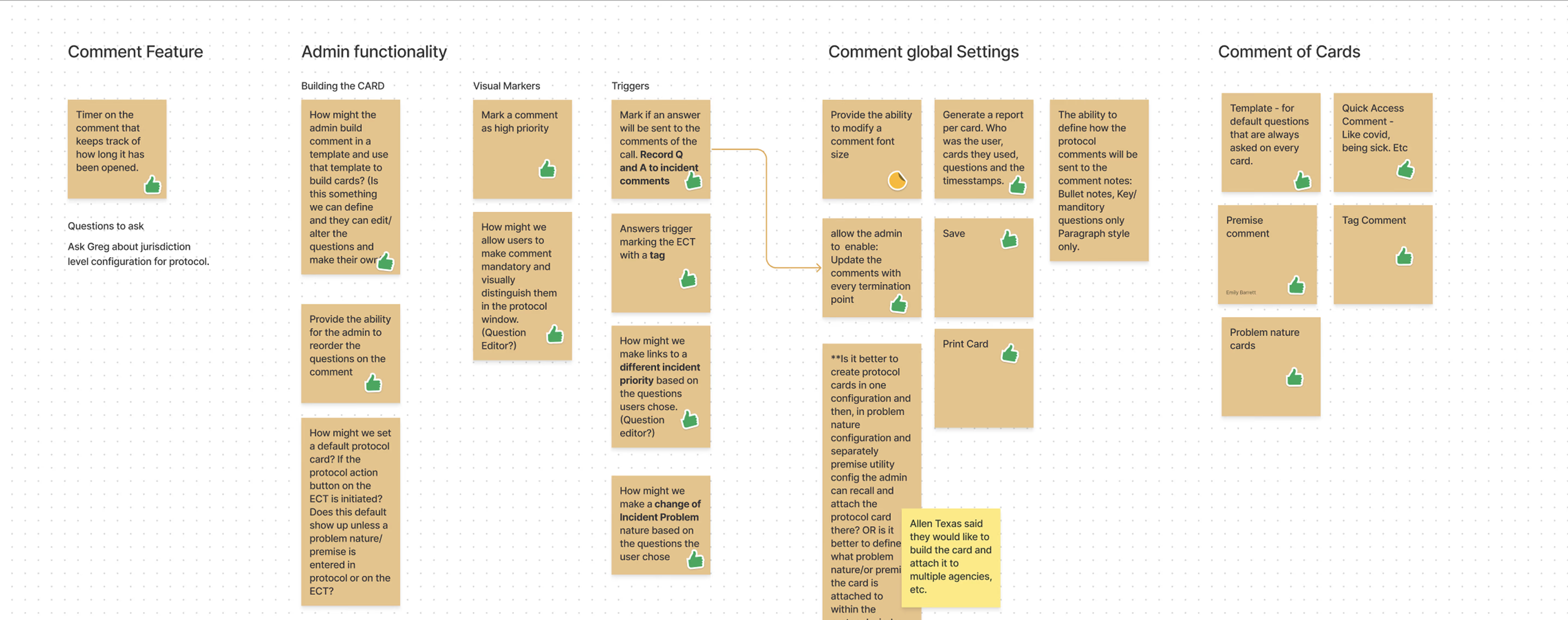
Using collaborative "How Might We" sessions, the team explored dozens of directions across comment features, admin functionality, visual markers, triggers, global settings, and card-based protocols. Ideas were voted on, tested against feasibility, and refined through stakeholder feedback loops.
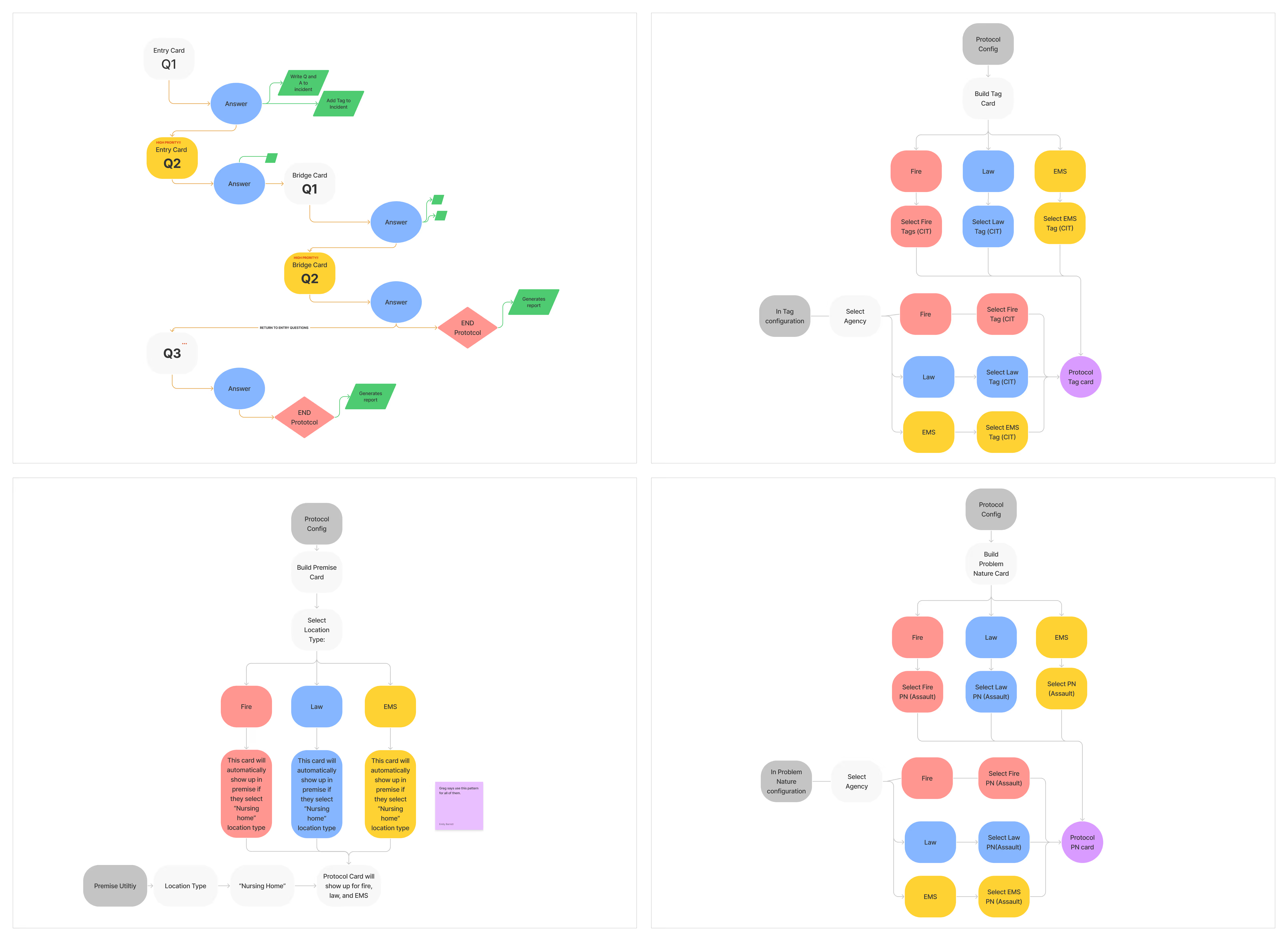
Key explorations included comment timers (tracking how long critical info has been visible), protocol cards (templated question sets for different incident types), priority tagging that could automatically escalate incident classification, and admin-configurable comment templates.
06 — Information Architecture
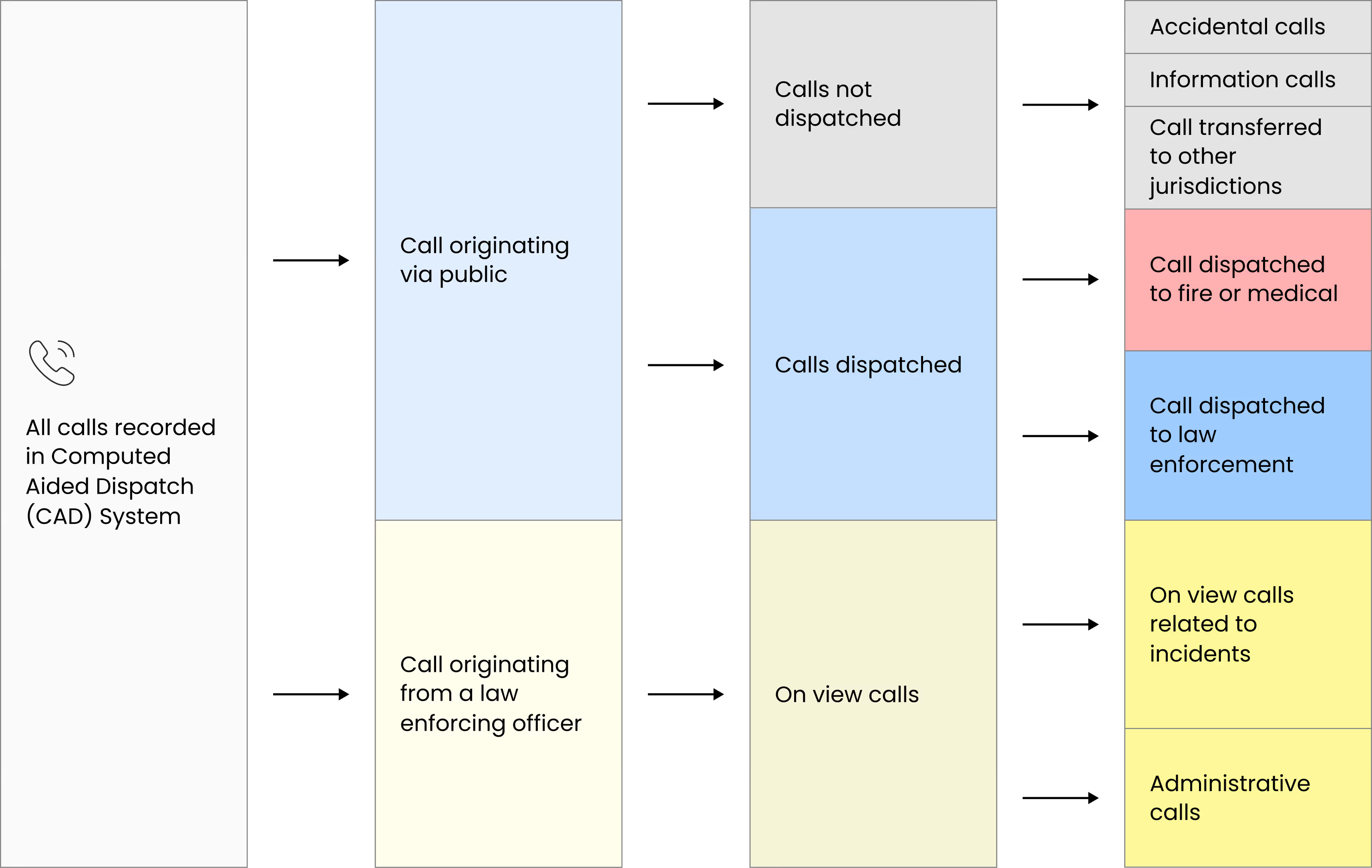
Every call that enters the system, whether from the public or a law enforcement officer in the field, gets recorded in the CAD system. From there, calls branch into two paths: dispatched or not dispatched. Non-dispatched calls include accidental dials, information requests, and transfers to other jurisdictions. The critical path is the dispatched calls, which get routed to fire/medical, law enforcement, or flagged as on-view incidents already being handled on the ground.
This branching flow looks simple on paper, but in practice it created significant friction. Call takers had to navigate the full complexity of this tree while a caller was on the line, often in distress. The redesign focused on making the dispatched path — the life-or-death path — as fast and frictionless as possible, while keeping the non-dispatched routes accessible without cluttering the primary workflow.
What looked like a logical branching structure in documentation became overwhelming in real emergency scenarios. Call takers had to navigate multiple paths while managing distressed callers, increasing cognitive load at critical moments.
The redesign prioritized the dispatched path, the life-critical flow, making it faster, clearer, and more linear. Secondary and non-dispatch routes were preserved but progressively revealed, ensuring access without clutter. The result was a streamlined experience that reduced hesitation, improved clarity, and supported faster, more confident incident creation under pressure.
07 — Ideating Solutions
By incorporating regular feedback loops with stakeholders and end-users, we fine-tuned our designs and strategies, ensuring a balance between innovative functionality and user-centric enhancements.
Prototype — Incident Creation
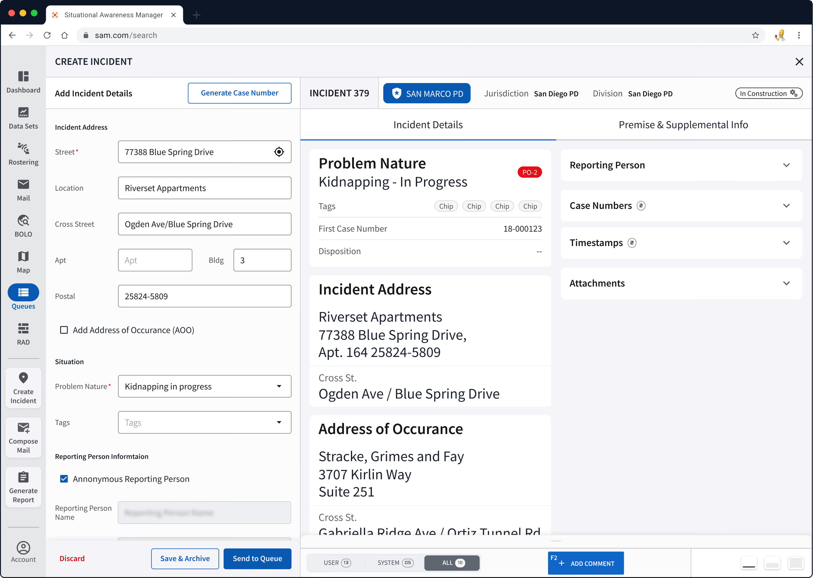
The incident creation panel consolidates address, situation, and reporting person information into a logical hierarchy. Fields are grouped to match the natural flow of a 911 call — location first, then what's happening, then who's reporting.


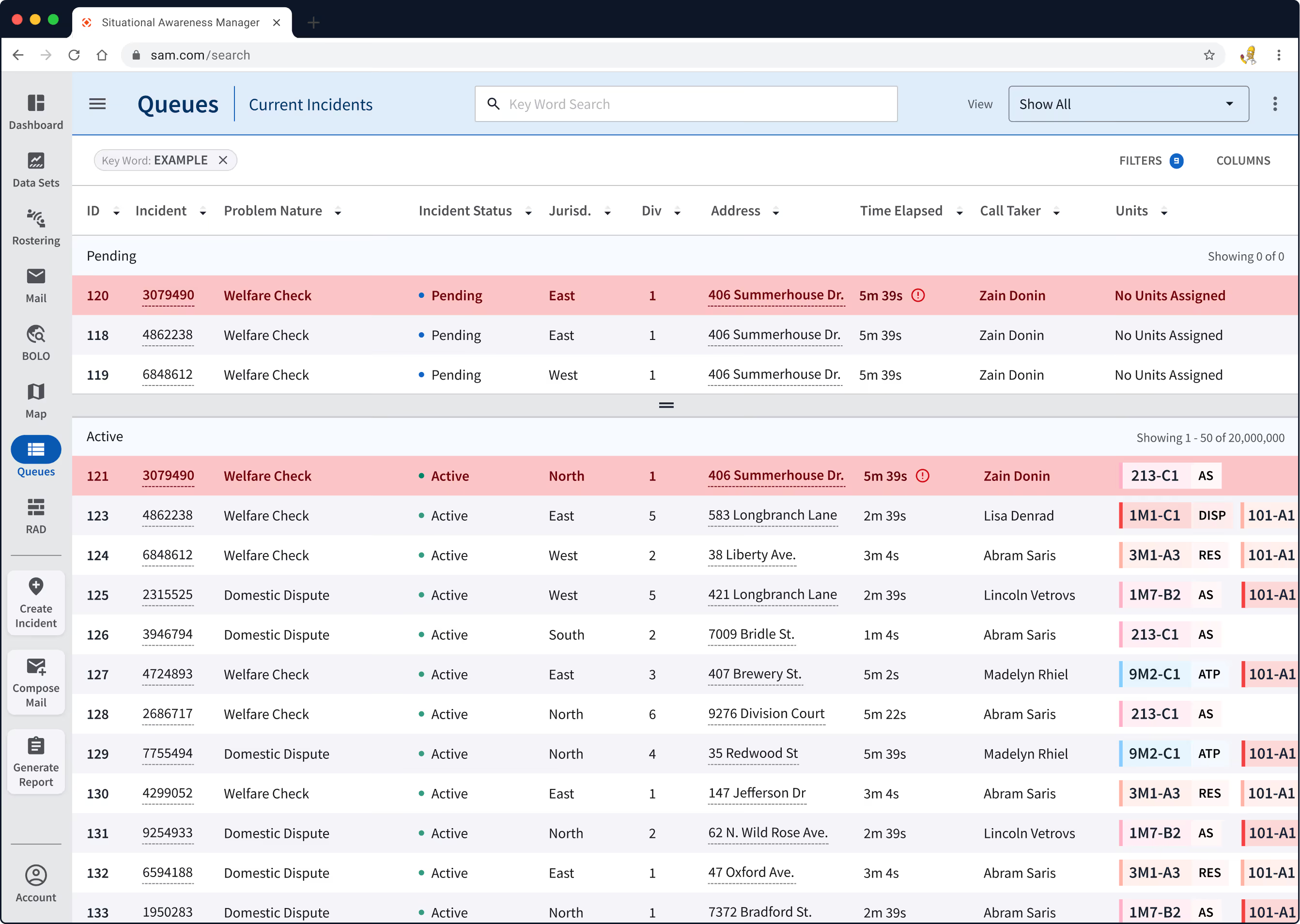
Report Incidents
Incident reporting dashboard was designed to provide a clear and streamlined interface, enabling dispatchers to swiftly input, categorise, and prioritise incident details.
