

01 — Overview
Web3 analytics needed a new language. Traditional chart libraries couldn't handle blockchain data's unique complexity—wallet addresses, multi-chain transactions, temporal on-chain patterns, and real-time updates at scale.
When I joined the ARCx project, the team was building "Google Analytics for Web3" from scratch. But blockchain data doesn't behave like web traffic. Wallet addresses replace cookies, transactions replace clicks, and every data point connects to a permanent on-chain record spanning years.
The problem wasn't just building charts, it was creating an entirely new visual language for decentralized data.
02 — Research & Discovery
I started by auditing existing analytics tools—Dune Analytics, Nansen, and traditional BI platforms. The pattern was clear: most tools either oversimplified blockchain data or overwhelmed users with complexity.
Key Research Findings
Temporal Depth
Wallet addresses can be 5+ years old. Traditional 30-day windows don't capture the full story.
Multi-Chain Complexity
Users interact across Ethereum, Polygon, and other chains simultaneously—visual distinction was critical.
Financial Context
Every data point has monetary value. Net worth, transaction value, and gas costs needed first-class treatment.
Identity Persistence
Unlike web sessions, wallet addresses are permanent. Cohort analysis needed to reflect long-term behavior patterns.
Key Insight
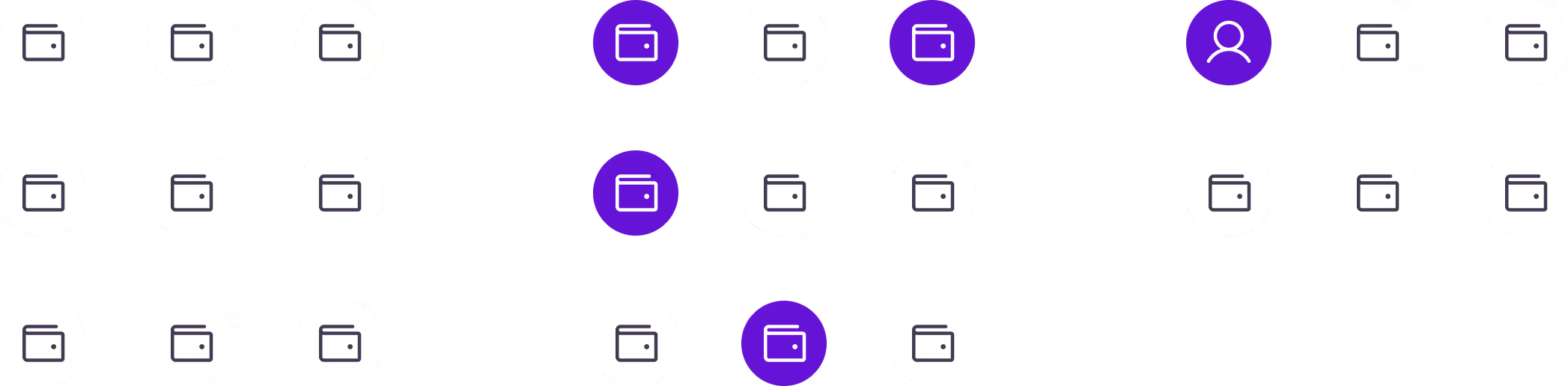
A single person might control dozens of wallets. A single wallet might be a bot, a multisig treasury, or someone's main spending account. The platform needed to surface users, not just addresses, so teams could base product and marketing decisions on accurate, human-level analytics.
03 — Design System Architecture
I architected the design system around three core principles: clarity, composability, and context-awareness. Every component needed to work independently while contributing to a cohesive analytical narrative.
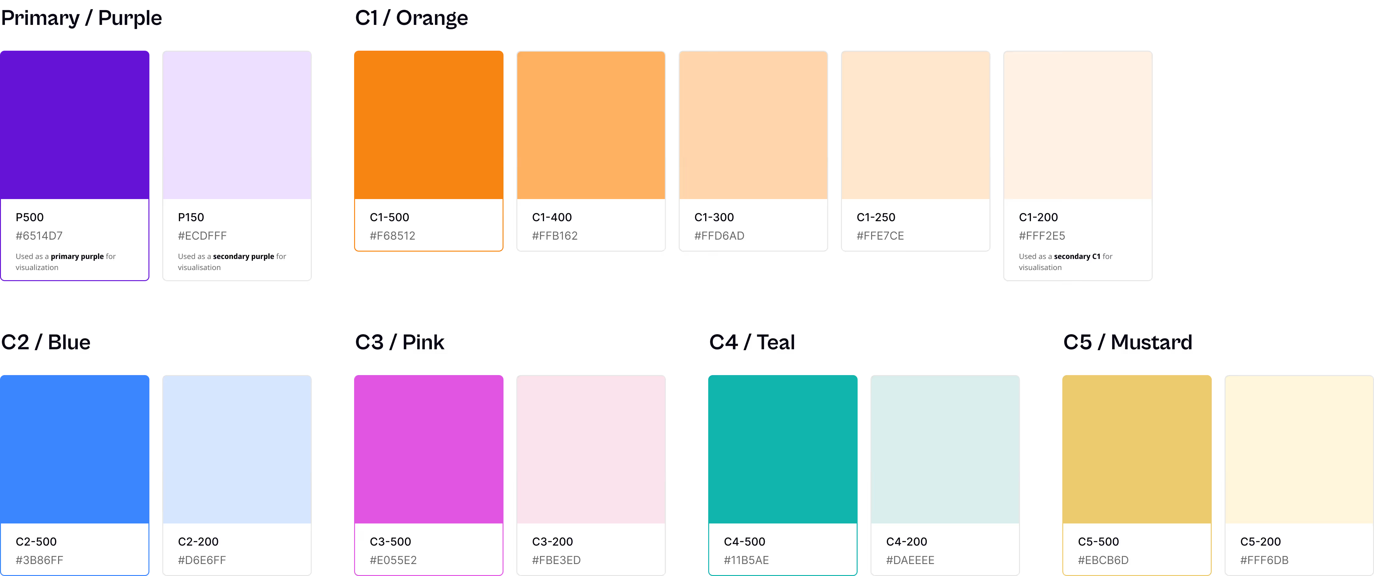
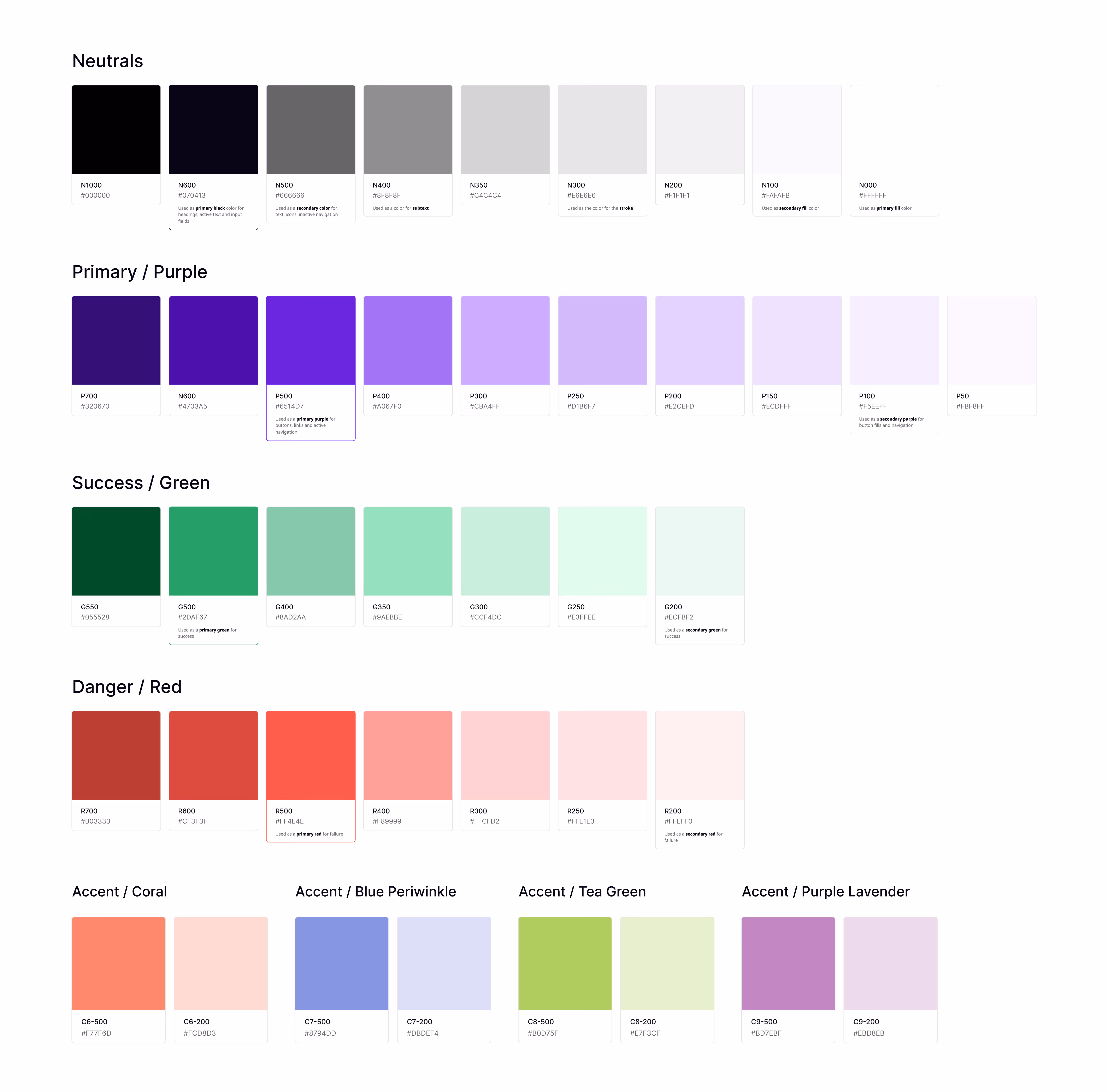
I established a semantic token system that mapped directly to blockchain concepts:
// Color Tokens for Data States
--color-chain-ethereum: #627EEA;
--color-chain-polygon: #8247E5;
--color-positive: #10B981;  // Growth, gains
--color-negative: #EF4444;  // Losses, churn
--color-neutral: #A0A0A0;   // Stable metrics

// Wallet Age Indicators
--age-new: 0-365 days
--age-established: 1-3 years
--age-veteran: 3+ years
This system allowed engineers to use semantic names like color-chain-polygon instead of arbitrary hex codes, ensuring consistency across all 12+ chart types.
Design Decision
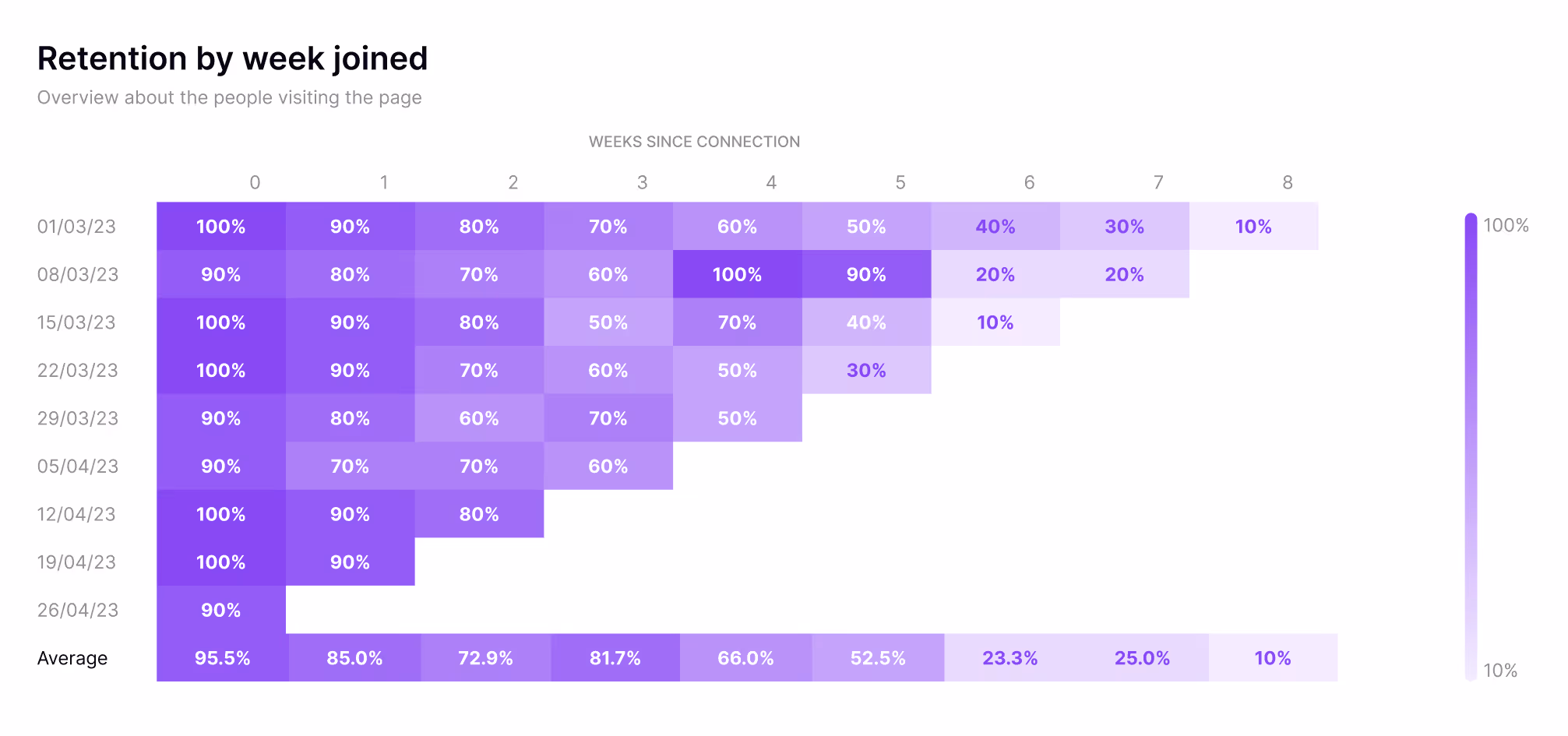
Instead of showing absolute numbers, I used percentage-based color scales (100% = deep purple, 10% = light purple). This normalized comparison across cohorts of different sizes and made patterns immediately visible.
Palette 1
This palette is primarily used for stacked area charts and stacked bar charts where two shades of the same hue are needed to distinguish between related data series, for example, new vs. returning wallets within the same cohort.
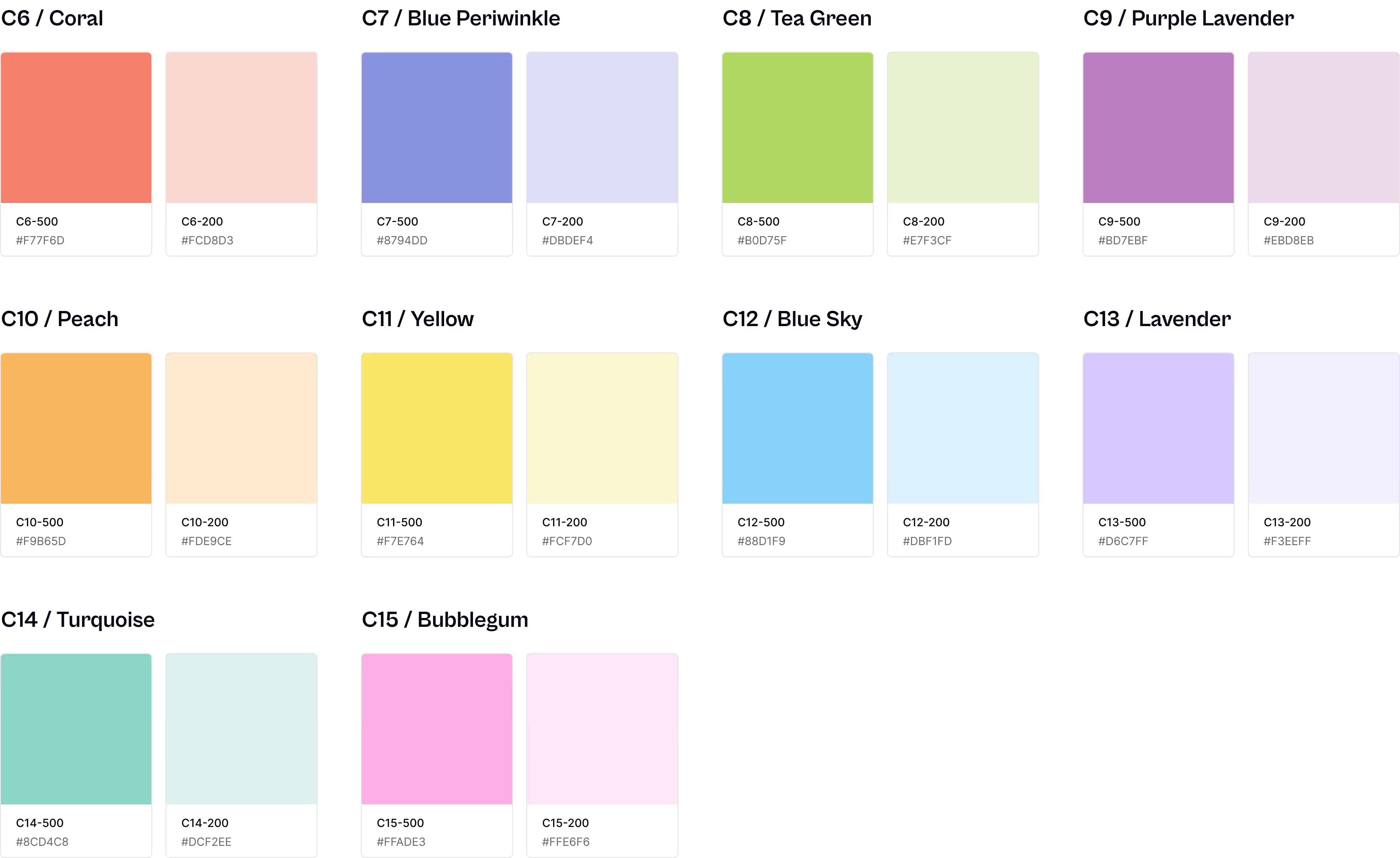
Palette 2
This palette is used for pie charts, grouped bar charts, and any visualization requiring multiple distinct categories. Each color was tested for WCAG contrast compliance and perceptual distinctness across both light and dark modes.
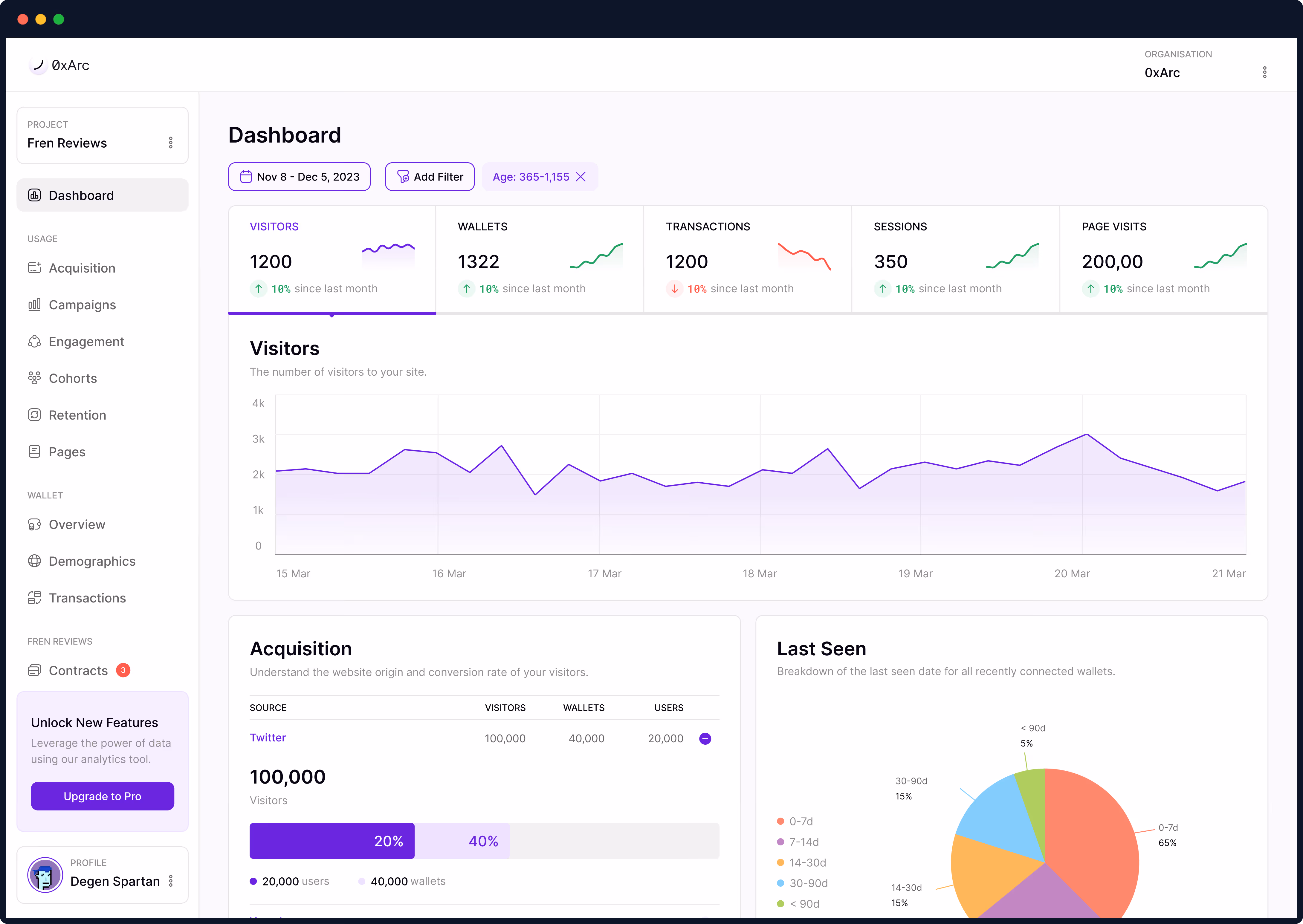
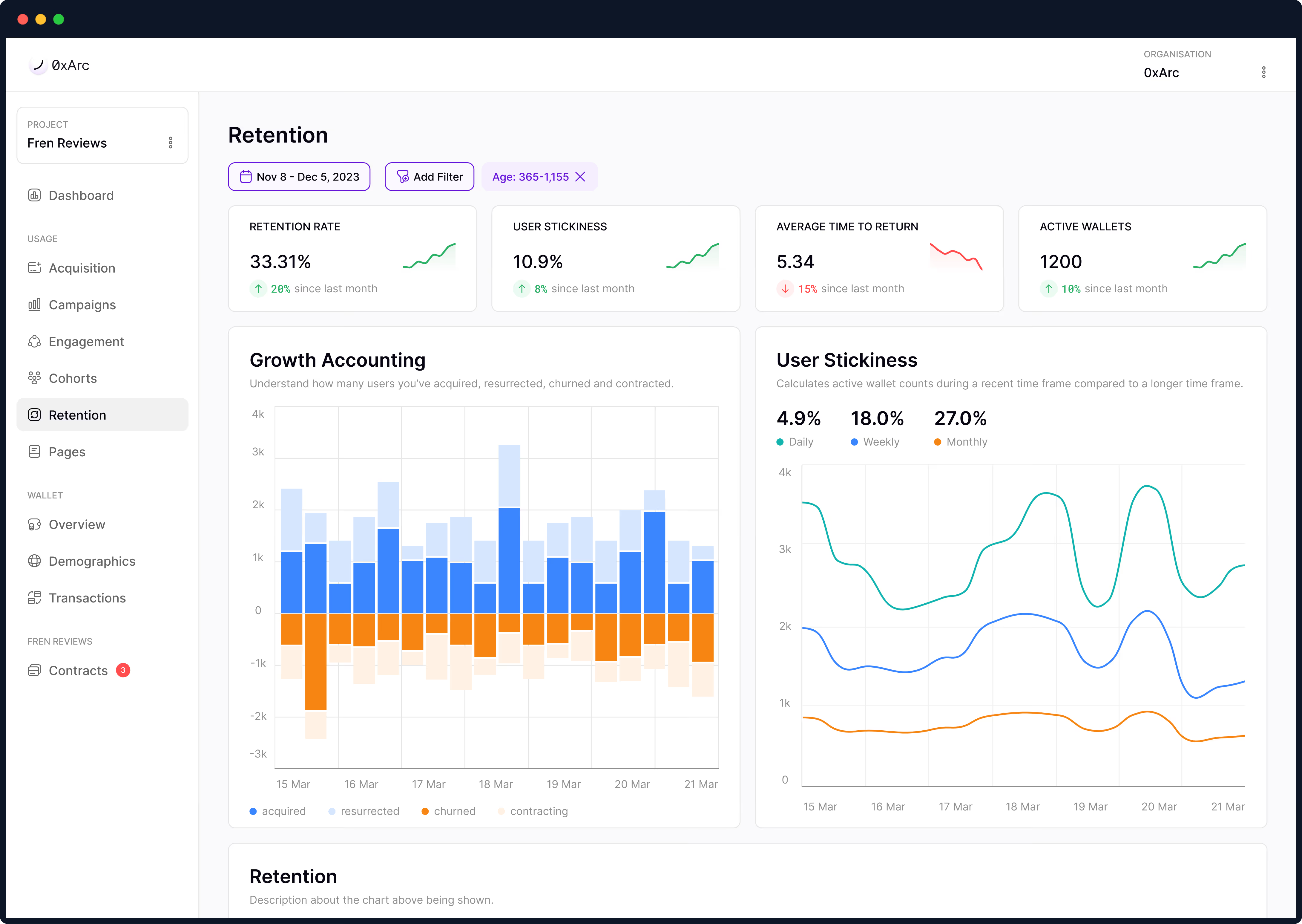
04 — AI-Powered Charts Library
The charts library became the heart of the design system. Rather than building static components, I designed context-aware visualizations that adapt based on data patterns.
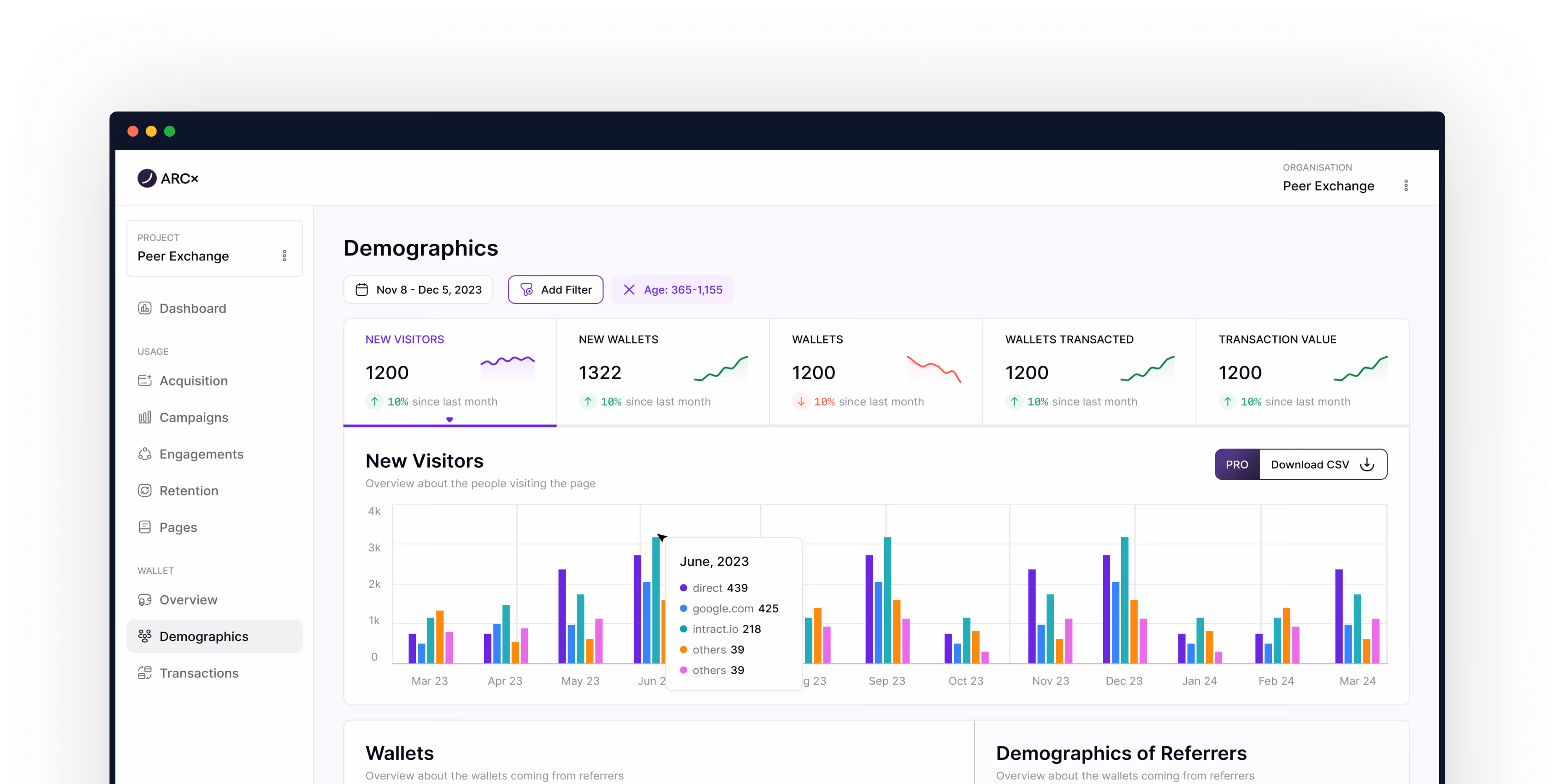
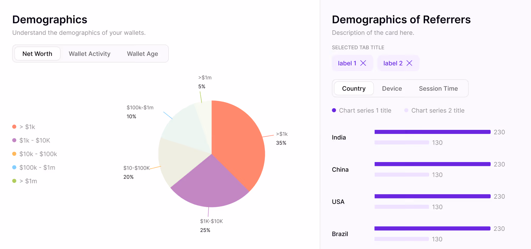
Demographics
Breaks down wallet holders by on-chain attributes like net worth brackets, transaction frequency, and chain preference, so teams can understand who their users actually are, not just what they do.
Wallet Journeys
Visualizes the path a wallet takes from first interaction to power user, mapping key milestones.

Cohorts
Groups Wallets tracks how each cohort's engagement evolves over weeks and months.

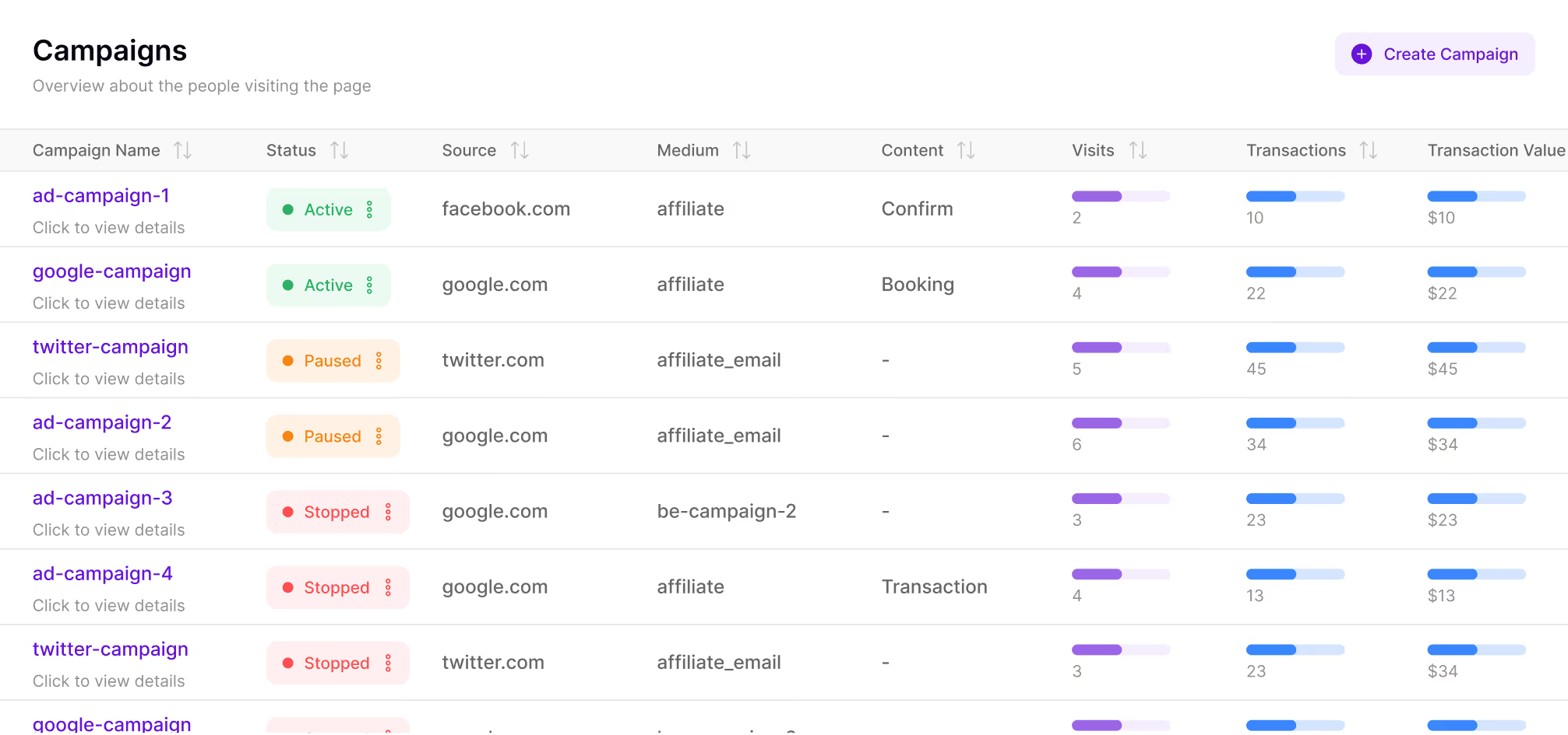
Campaigns
Connects on-chain activity directly to marketing campaigns, showing which incentives (airdrops, quests, referral programs) drive real engagement versus one-time claimers.
Retention
Measures how many wallets return after their first interaction, broken down by time window. Color-coded heatmaps make it immediately clear where drop-off happens and which cohorts stick.
Engagement
Tracks depth of interaction like transaction count, unique contract calls, and active days per wallet.
05 — AI Integration
The breakthrough came when we integrated AI to automatically configure chart settings based on data patterns. Rather than forcing users to manually choose chart types and configure axes, the system learned from usage patterns.
When a user uploads a dataset or creates a new view, the AI analyzes:
Based on this analysis, the system recommends the optimal visualization—line chart for trends, bar chart for comparisons, heatmap for temporal patterns, or funnel for conversion flows.
One subtle but powerful AI feature: automatic color assignment that maintains consistency across sessions. The system remembers that "google.com" should always be orange, "twitter.com" should always be blue—even across different charts and timeframes.
This eliminated a major pain point: users no longer had to manually configure colors or decipher inconsistent legends.
Each chart component includes built-in intelligence for handling Web3 data:
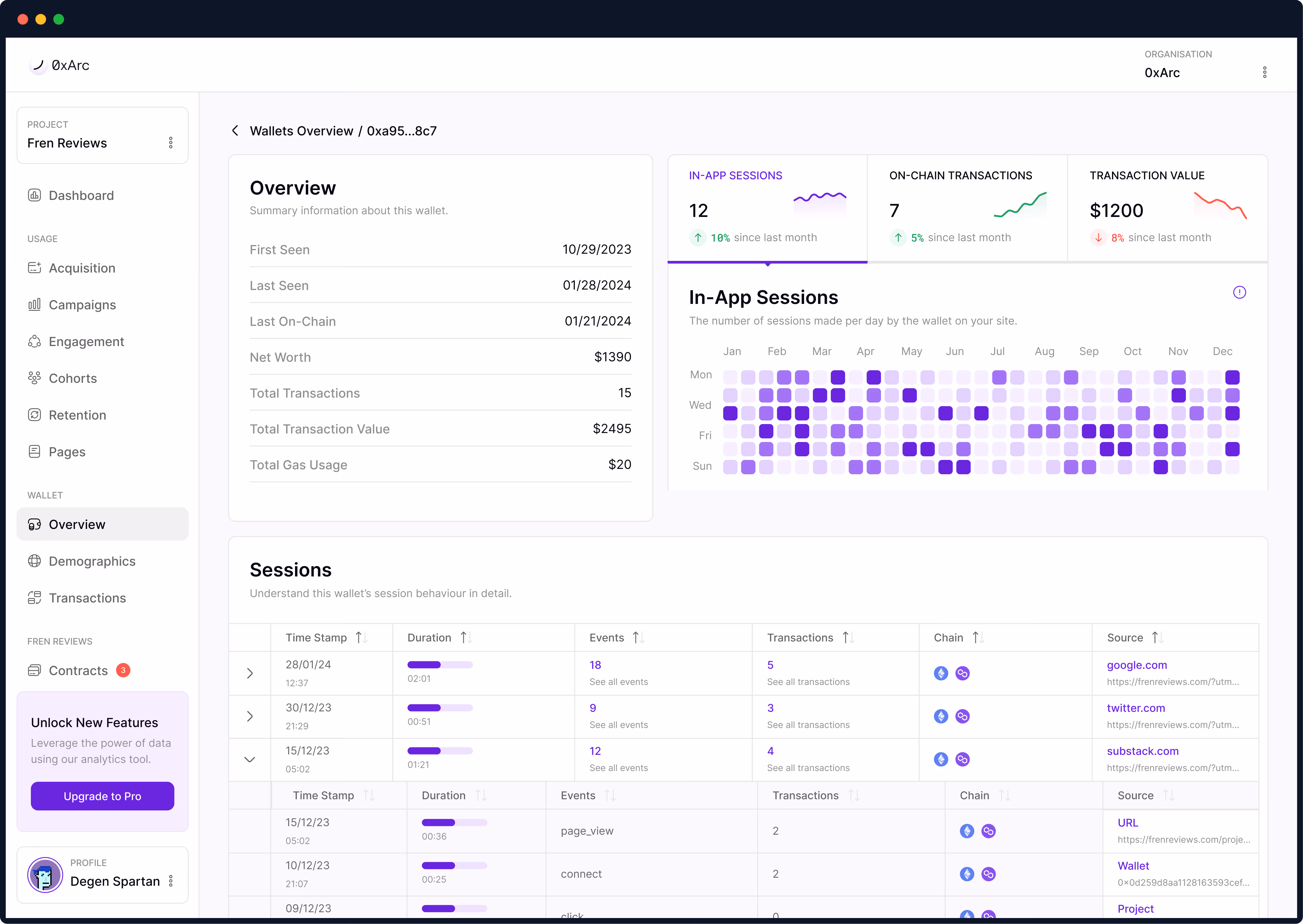
0xa95...8c7 format with hover-to-reveal full address and copy functionality.06 — Prototype
The main dashboard surfaces critical metrics at a glance while providing drill-down access to every chart in the system. The layout follows a progressive disclosure pattern:
06 — Prototype
A filterable, sortable view of every wallet interacting with a protocol designed to help analysts quickly separate power users from bots.
06 — Prototype
A filterable, sortable view of every wallet interacting with a protocol designed to help analysts quickly separate power users from bots.
07 — Performance & Scale
Web3 analytics operate at a different scale than traditional web analytics. A single popular dApp can generate millions of wallet interactions per day, and users expect real-time updates as on-chain events occur.
The most technically challenging aspect was building real-time chart updates without sacrificing performance. When new transactions occur on-chain, charts needed to update smoothly without jarring redraws.
I designed a micro-animation system that transitions data points rather than replacing them:
Micro-Interaction Principle
Every data update should feel like a natural evolution, not a disruptive replacement. The chart breathes with the data, creating a sense of living system rather than static reports.
08 — UI Design
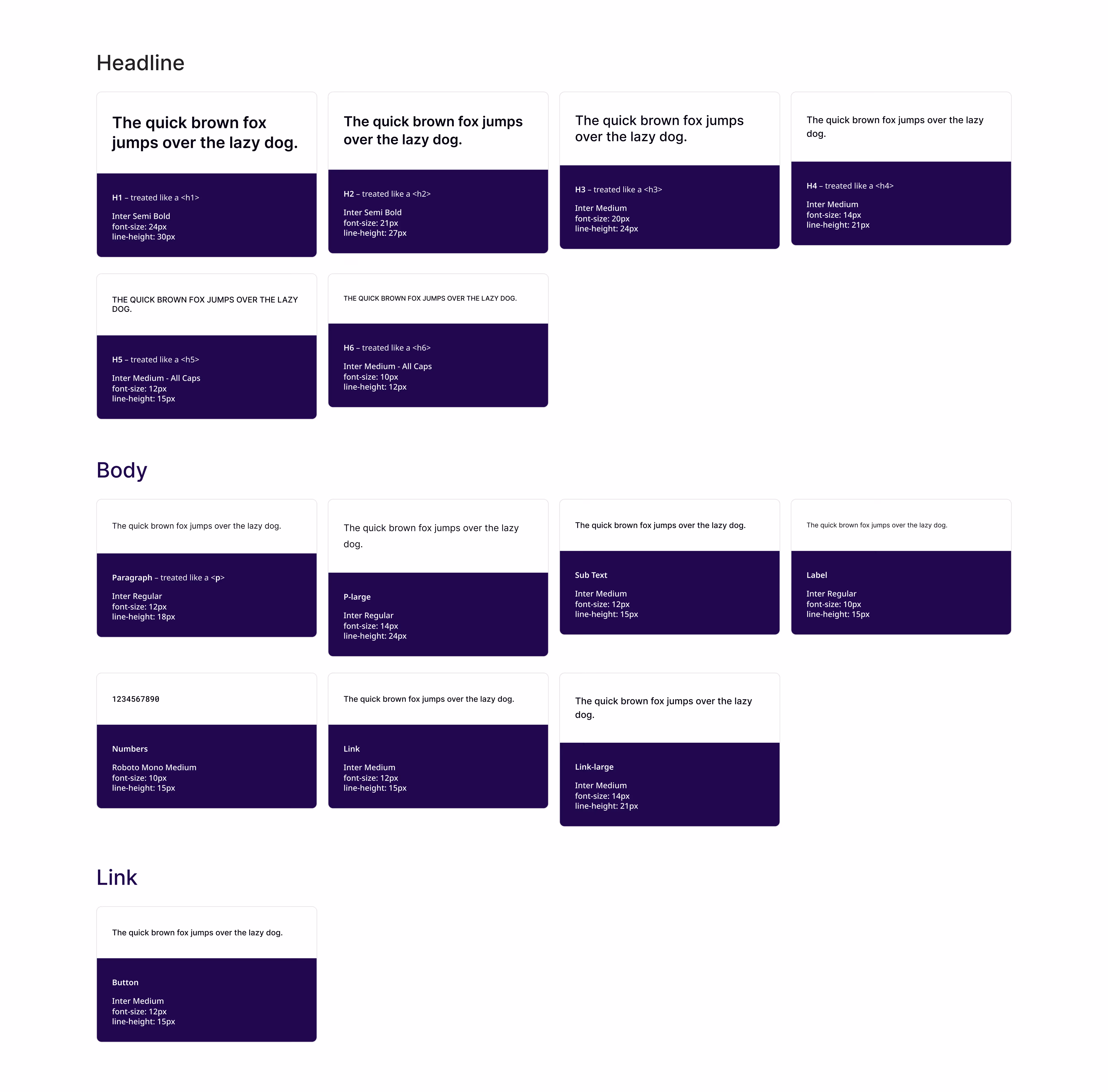
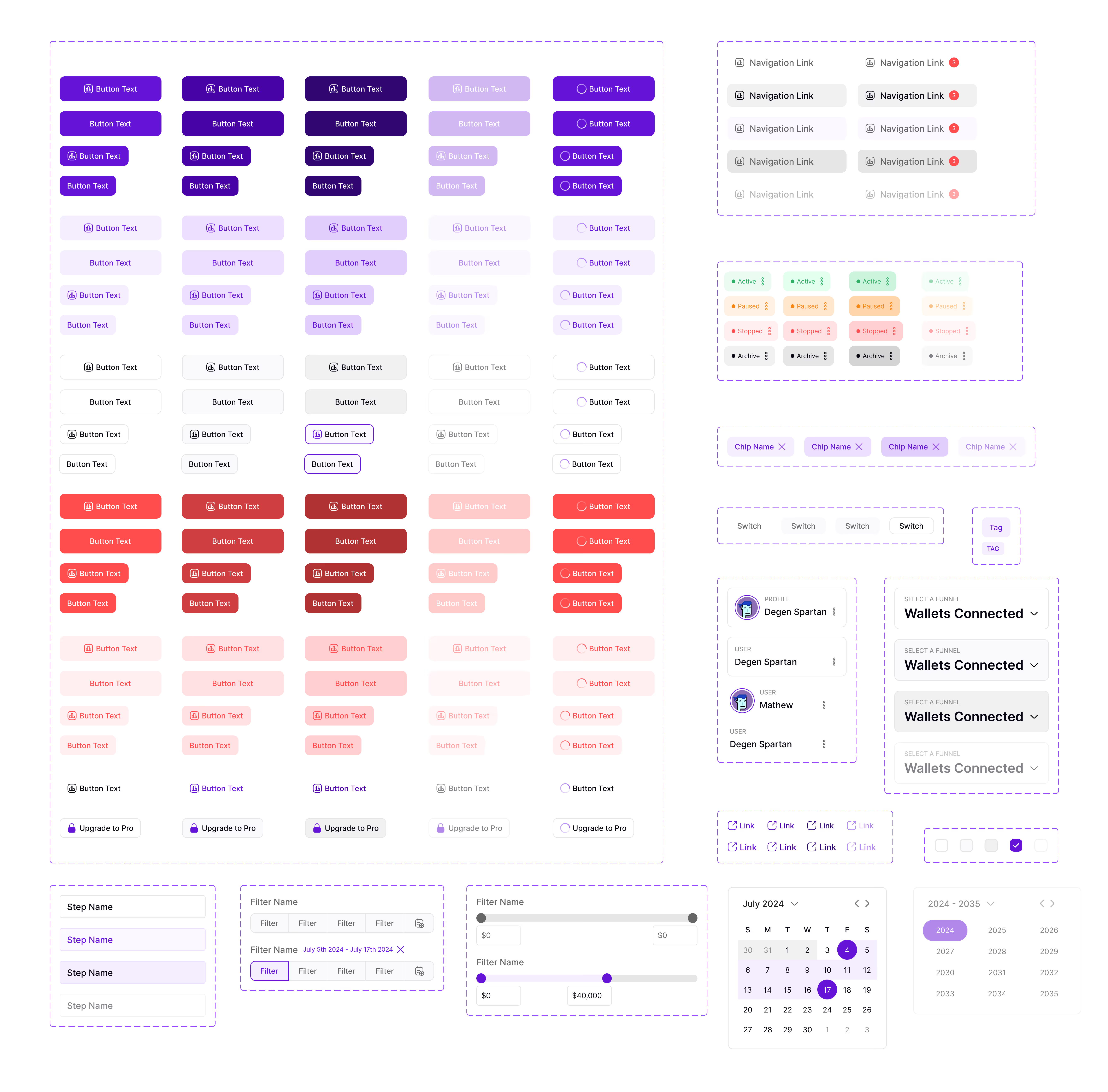
A foundational design system with tokens for color, typography, and components ensured consistency across all screens, modes, and team contributions.
Every color maps to a semantic purpose: chain identifiers, data states, surface tones, and accessibility-tested contrast pairs. Teams pick from a controlled palette instead of eyeballing hex values.
A tokenized type scale covering metric values, axis labels, chart legends, and body text. Defined sizes, weights, and line heights ensure clear hierarchy across dashboards and data tables.
The full library of building blocks: buttons, inputs, modals, dropdowns, cards, chart containers, and table primitives. Each documented with usage guidelines, interaction states, and responsive behavior.
09 — Impact & Results
A design system is only as good as its adoption. With 3 engineering teams and 8+ designers working on the platform, I needed to make the system effortless to use correctly and hard to use incorrectly.
The Multiplier Effect
By investing 6 months in building a robust design system, we unlocked years of compounding efficiency. Each new feature now ships 3x faster, with 95% fewer iterations, and maintains perfect visual consistency across the entire platform.
10 — Lessons Learned
A design system is only as good as its adoption. While working on the platform, I needed to make the system effortless to use correctly and hard to use incorrectly.
Start with Design Tokens Earlier
Invest in Automated Testing from Day One
Document Design Decisions
Build a Contribution Model Early